New Abbott Pentothal Postcard Discoveries? Same-Picture Cards
…some with same messages and different script typefaces, others with different messages
and same script typefaces, and others with different messages and different script typefaces!
by Roger Cichorz, December 23, 2010
I previously reported two different typefaces on a same-picture Abbott Pentothal card with the same English-language text message (San Marino “Honor Guard – Government Palace,” #144 on Tom Fortunato’s checklist) [Reference: “A New Discovery: Same Abbott Card, Same Message, but Different Script Typefaces!,” August 30, 2009, posted on Tom Fortunato’s “Dear Doctor Club” Website.] At the time of that report, I indicated there may be additional Abbott Pentothal cards of this nature, and readers were urged to examine their cards and report any other instances of same-picture cards with different typefaces. I am pleased to report that I recently acquired two more Abbott Pentothal cards with identical English-language text messages that are in different script typefaces.
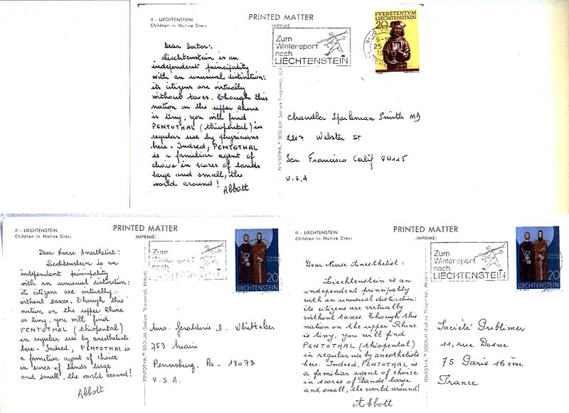
Figure 1. Liechtenstein “Children in Native Dress” Same-Picture Cards (#87).
The same ad message is on the “Dear Doctor” and two “Dear Nurse-Anesthetist” cards, but in different script typefaces. The script typeface on the card to Pennsburg, PA is almost the same (but not as bold and one line shorter) as that used for the ad message on the “Dear Doctor” version.
(Image of “Dear Doctor” to California card courtesy of David C. Lai)
The first is the Liechtenstein “Children in native Dress” card (#87 on Tom Fortunato’s master checklist). Both of my cards are the “Dear Nurse Anesthetist” versions, but, when you view the ad messages on the two cards (Figure 1), the difference in script typefaces will be readily apparent. Interestingly, one of the cards is addressed to “Société Publimer” in Paris, but the advertising text is in English! It turns out that Société Publimer is a subsidiary of Le Biomarine, Dieppe, France, publisher of 19 series of “Dear Doctor” advertising postcards, primarily for its Plasmarine, Ionyl, and Marinol drugs. I do not have the “Dear Doctor” version of this card, but one is illustrated on page 128 of David C. Lai’s Pentothal Postcards. The ad message is the same as on the ”Dear Nurse Anesthetist” version. It appears to be in the same script typeface as my “Dear Nurse Anesthetist” card mailed to Pennsburg, PA, but is darker and bolder, and the last four lines of text on the “Nurse” version is spread out over five lines on the “Dear Doctor” version.
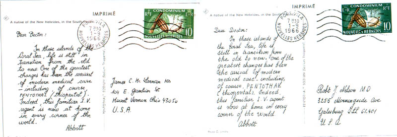
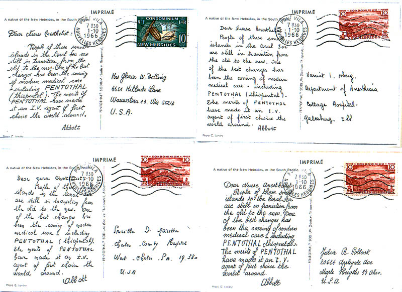
Figure 2. New Hebrides “Native with Hatchet” Same-Picture Cards (#121).
All six of these cards are in different script typefaces. The ad message on the “Dear Doctor” version differs from that on the “Dear Nurse Anesthetist” version. The “C in Diamond” symbol is at top left of the two “Dear Doctor” cards, but absent on the “Dear Nurse Anesthetist” counterparts.
(Image of “Dear Doctor” to Ohio card courtesy of David C. Lai)
Even more astounding is the next discovery pertaining to the Abbott Pentothal “Native with hatchet” postcards of New Hebrides (#121) (Figure 2). I have one New Hebrides “Dear Doctor” and four “Dear Nurse Anesthetist” cards in my collection. The ad message on the “Dear Doctor” card is different than the message on the “Dear Nurse Anesthetist” cards, which is not unusual, and, as expected, the ad message is the same on all four of the “Dear Nurse Anesthetist” cards. What is so unusual, though, is the fact that all five text messages are in different script typefaces! Furthermore, my “Dear Doctor” version has a different script typeface from the card pictured on page 184 of Pentothal Postcards. The “Abbott” signature, which is the giveaway for the simulated handwritten message, is different for all six of these cards! Who knows? ? there may be even more different script typefaces then I am reporting here as we only have six of these cards to compare to one another. So, once again, readers who have the New Hebrides cards are encouraged to compare theirs to these six and report any additional findings.
One additional characteristic of the New Hebrides card is perhaps worth mentioning. The “Dear Doctor” version has a “C in diamond” symbol at the top left, while the “C in diamond” is absent on the “Dear Nurse Anesthetist” version. This “C in diamond” symbol appears on other Abbott Pentothal cards mailed in 1965-68, but of the ten different examples in my collection, all are on the “Dear Doctor” versions and absent on their “Dear Nurse Anesthetist” counterparts. Several of the cards cited later in this article also have the “C in diamond” symbol and that characteristic is noted in the text.
In my previous report, I indicated that, with an exception of the Mexico “Funeral Mask Mosaic of Axestone” card (#105), the text typefaces of all the other nurse-anesthetist versions in my collection do not differ substantially from their same-picture counterparts with the “Dear Doctor” salutations. This is no longer the case as I have added numerous cards to my collection since that report, and I will describe additional findings here for the record. Also, some of the “Dear Doctor” and “Dear Nurse Anesthetist” counterparts have different ad messages (albeit usually in the same script typeface), so these will be listed and illustrated here as well. I lacked the “Dear Doctor” or “Dear Nurse” counterpart in five instances, and relied on illustrations in Pentothal Postcards to make the comparisons.
Figure 3. Andorra “Bridge over the Valley” Same-Picture Cards (#2).
The “Dear Doctor” card and two “Dear Nurse Anesthetist” cards have the identical ad message, but each one is in a different script typeface.
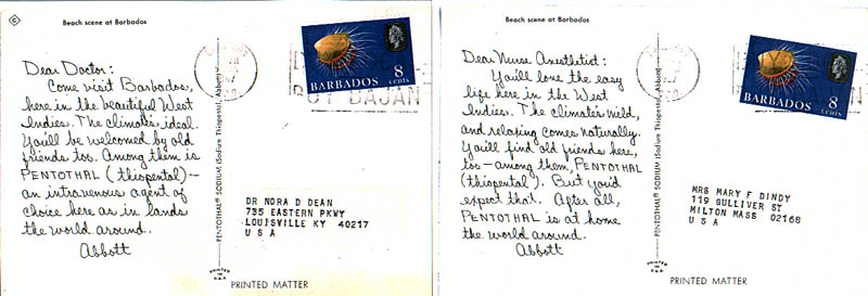
Figure 4. “Beach Scene at Barbados” Same-Picture Cards (#17).
The “Dear Doctor” and “Dear Nurse Anesthetist” cards have the same script typeface but different ad messages. The “C in diamond” symbol appears top left on the “Dear Doctor” card but is not on the “Dear Nurse Anesthetist” card.
The three Andorra “Bridge over the Valley” cards (#2) in my collection, one “Dear Doctor” version and two “Dear Nurse Anesthetist” versions (Figure 3), have the same ad message but all three are in different script typefaces.
The two Barbados ”Beach scene” cards (#17) in my collection have the same script typeface, but the ad messages are different for the “Dear Doctor” and “Dear Nurse Anesthetist” versions (Figure 4). The “Dear Doctor” version has the “C in Diamond” symbol at upper left, but the “Dear Nurse…” version does not.
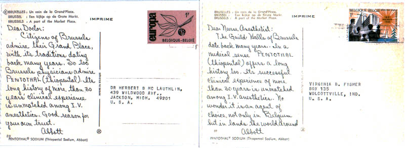
Figure 5. Belgium “Brussels, A Part of the Market Place” Same-Picture Cards (#17).
The “Dear Doctor” and “Dear Nurse Anesthetist” cards have the same script typeface but different ad messages. The “C in diamond” symbol is on the “Dear Doctor” card but not on the “Dear Nurse Anesthetist” card.
The two Belgium “Brussels, A Part of the Market Place” cards (#20) in my collection (Figure 5), a “Dear Doctor” version and a “Dear Nurse Anesthetist” version, have the same script typeface but different ad messages. The “C in diamond” symbol appears on the “Dear Doctor” card but not on the “Dear Nurse Anesthetist” card.
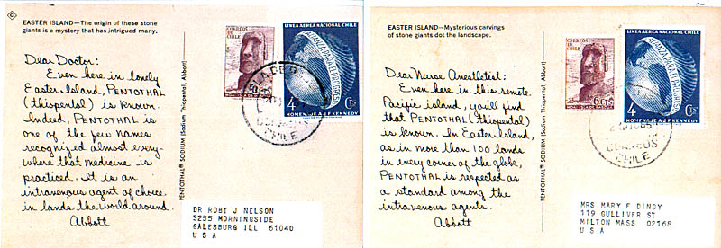
Figure 6. Chile Easter Island “…stone giants…” Same-Picture Cards (#30).
The “Dear Doctor” and “Dear Nurse Anesthetist” cards have the same script typeface but different captions at the top and different ad messages. The “C in diamond” symbol is on the “Dear Doctor” card but not on the “Dear Nurse Anesthetist” card.
The two Chile Easter Island “…stone giants…” cards (#30) in my collection (Figure 6) have the same script typeface, but the ad messages are different for the “Dear Doctor” and “Dear Nurse Anesthetist” cards. Note also that the text of the captions is different for the two versions, which is unusual if not unique. The “Dear Doctor” version has the “C in Diamond” symbol at upper left, but the “Dear Nurse…” version does not.
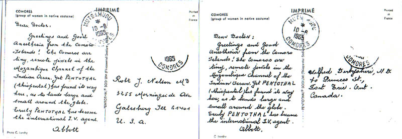
Figure 7. Comoros “group of women in native costume” Same-Picture Cards (#36).
Two “Dear Doctor” cards have the same messages but in different script typefaces. The version addressed to the U.S. is printed in blue and the version to Canada is printed in black.
(Image of “Dear Doctor” to Canada card courtesy of David C. Lai)
The Comoros “group of women in native costume” card (#36) in my collection is a “Dear Doctor” version but has a different script typeface from the “Dear Doctor” card illustrated on page 164 of Pentothal Postcards (Figure 7). Also, my card is addressed to the U.S. and printed in blue, but the card in Pentothal Postcards is addressed to Canada and appears to be printed in black, a situation akin to the U.S.A. (Hawaii) “Waikiki Beach” card (#171) in which the French text message in the “D” version is printed in black rather than green. As an aside, unfortunately, the stamps had been removed from both of these Comoros cards.
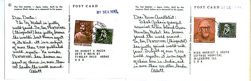
Figure 8. India “Taj Mahal” Same-Picture Cards (#68).
The “Dear Doctor” and “Dear Nurse Anesthetist” cards have the same script typeface but different ad messages. The “C in diamond” symbol is on the “Dear Doctor” card but not on the “Dear Nurse Anesthetist” card.
(Image of “Dear Doctor” to Ohio card courtesy of David C. Lai)
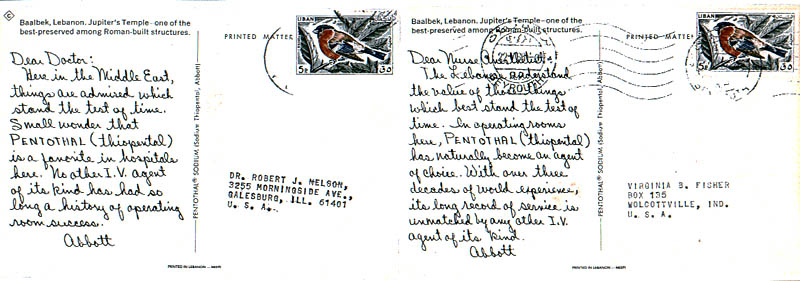
Figure 9. Lebanon “Baalbek, Jupiter’s Temple Same-Picture Cards (#84).
The “Dear Doctor” and “Dear Nurse Anesthetist” cards have the same script typeface but different ad messages. The “C in diamond” symbol is on the “Dear Doctor” card but not on the “Dear Nurse Anesthetist” card.
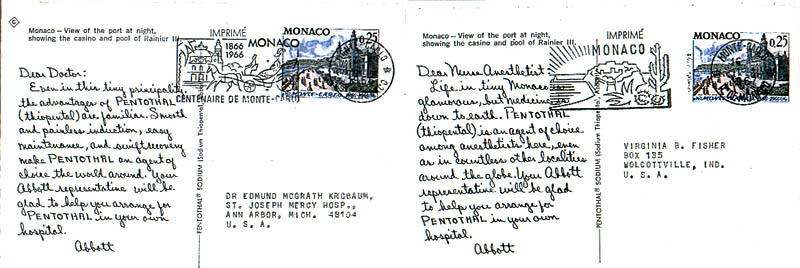
Figure 10. Monaco “View of the port at night” Same-Picture Cards (#112).
The “Dear Doctor” and “Dear Nurse Anesthetist” cards have the same script typeface but different ad messages. The “C in diamond” symbol is on the “Dear Doctor” card but not on the “Dear Nurse Anesthetist” card.
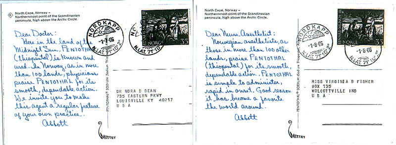
Figure 11. Norway “North Cape” Same-Picture Cards (#127).
The “Dear Doctor” and “Dear Nurse Anesthetist” cards have the same script typeface but different ad messages. The “C in diamond” symbol is on the “Dear Doctor” card but not on the “Dear Nurse Anesthetist” card.
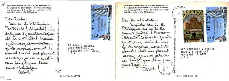
Figure 12. Philippines “Ifugao Village” Same-Picture Cards (#133).
The “Dear Doctor” and “Dear Nurse Anesthetist” cards have the same script typeface but different ad messages. The “C in diamond” symbol is on the “Dear Doctor” card but not on the “Dear Nurse Anesthetist” card.
The India “Taj Mahal” card (#68) in my collection is a “Dear Nurse Anesthetist” version that has the same script typeface as the “Dear Doctor” version illustrated on page 130 of Pentothal Postcards (Figure 8), but the ad messages are different. The “C in diamond” symbol appears at the upper left on the “Dear Doctor” version but not on the “Dear Nurse Anesthetist” version.I have the “Dear Doctor” and “Dear Nurse Anesthetist” versions of the following four cards in my collection: Lebanon “Baalbek, Jupiter’s Temple” (#84) (Figure 9), Monaco “View of the port at night” cards (#112) (Figure 10), Norway “North Cape” cards (#127) (Figure 11), and Philippines “Ifugao Village” cards (#133) (Figure 12). Although each pair has the same script typeface, there are different ad messages for the “Dear Doctor” and “Dear Nurse Anesthetist” versions for each. The “C in diamond” symbol appears at the upper left on all four of these “Dear Doctor” versions but not on the “Dear Nurse Anesthetist” versions.
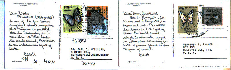
Figure 13. Venezuela “Gran Sabana” Same-Picture Cards (#174).
The “Dear Doctor” and “Dear Nurse Anesthetist” cards have the same script typeface but different ad messages.
(Image of “Dear Doctor” to Connecticut card courtesy of David C. Lai)
The Venezuela “Gran Sabana” card (#174) in my collection is a “Dear Nurse Anesthetist” version that has the same script typeface as the “Dear Doctor” card illustrated on page 64 of Pentothal Postcards (Figure 13), but the ad messages are different.
What I am finding is that more variants (differences in script typefaces or ad message or both) are showing up as more cards are examined and compared to one another. These variations appear most prevalent in the scarcer Abbott cards issued from 1964 into 1968. The earlier issued same-picture cards had little or no variation of script typeface and message in their “Dear Doctor” and “Dear Nurse Anesthetist” counterparts. I suspect that for many of the cards listed in this article, more script typefaces exist than are reported here. Perhaps this article will serve as an impetus to compare your cards to these and others and report additional findings.
My list is not exhaustive by any means (although it is complete for the cards I presently have in my collection), but I am of the opinion that more pairs (“Dear Doctor” versus “Dear Nurse Anesthetist” versions of a same picture card) will have different ad messages. I predict this will certainly be the case for the other later-issued “C in diamond” cards that I lack in my collection, most notably China/Taiwan “Pineapple cart, Hualien” (#32), Netherlands “Madurodam” (#117), and Peru “Llamas” (#132), that is, provided the “Dear Nurse/Anesthetist” versions exist for these cards.
Furthermore, it is also likely that either the script typeface or the messages will differ for the “Dear Doctor” and “Dear Nurse Anesthetist” versions of the later-issued cards lacking the “C in diamond” symbol, notably the Ecuador “Riobamba” (#39) and Kenya “Greetings from East Africa” (#82) cards that are known to exist in both versions. This might also be the case if the counterpart cards exist for the following: Argentina “Iguaza Falls” (#8), Chile “Rio Mapocho” (#31), Fiji “Police Trumpeters” (#40), French Polynesia “Tahiti Beach scene” (#46), India “Victoria Terminus” (#69), Ireland “County Dublin” (#73), Jamaica “Straw Market” (#78), Jordan “Dome of the Rock” (#81), Lebanon “Roman Ruins, Anjar” (#85), Malaya Selangor “Malay Mosque” (#89), Malta “Old Fortification of Valletta” (#91), Nicaragua “Ruben Dario Monument” (#125), Pakistan “Shalamar Gardens” (#129), and Trinidad & Tobago “Piarco Airport” (#166).
In conclusion, I hope this article will serve as an impetus for readers to look further and report additional findings to Tom. It is somewhat surprising that after more than 40 years after the last card was issued, discoveries about the Abbott Pentothal “Dear Doctor” cards are still being made and, no doubt, will continue to be made!