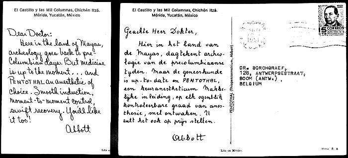
#109 - Mexico: El Castillo y las Columnas, Chichen Itza- Dutch differs from English
by Roger S. Cichorz, August 30, 2009, updated Oct. 2
As a corollary to the find reported in my article titled “A New Discovery: Same Abbott Card, Same Message, but Different Script Typefaces!”, I reexamined every Abbott card in my collection, looking for additional different typefaces on the same-picture postcards with texts in different languages. For the 50 same-picture cards in my collection with different language texts (primarily French, German, Italian, Spanish, and Swedish), 31 of the 50 are typeset in virtually identical simulated-handwritten typefaces (or actual handwriting by the same person if the text message was produced by electrotype or some other duplicating printing process) as their English-language text counterparts.
It appears to me that a reasonable attempt was made with the majority of cards to duplicate the “handwriting” of the English text cards with those in the other languages. In general, where the typefaces differ between the English text and other foreign language texts for the same-picture card, the differences are subtle, but not in all instances. Differences in the “Abbott” signature lines are usually the “giveaway” for different typefaces!
Listings and explanations are given in Table 1 for the 20 same-picture cards in my collection that I consider to have significantly different typefaces for some of their different-language-text versions. These are termed the “exception cards” ? some of which are discussed in more detail in the following paragraphs. The list in Table 1 is not exhaustive by any means as my collection lacks considerable numbers of same-picture cards in different-language texts. So, readers are urged to examine their same-picture but different-language text cards and report other examples of different typefaces.
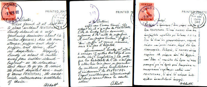
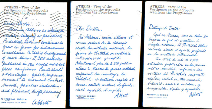
Figure 2. English-Text, French-Text, and Spanish-Text Versions of Greece – Athens, View of the Parthenon (#62).
These three same-picture, same-message cards are in different script typefaces
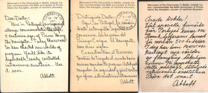
Figure 3. English-Text, Spanish-Text, and Swedish-Text Versions of Portugal – Monument of the Discoveries in Belém (# 135).
These three same-picture, same-message cards are in different script typefaces.
One of the major exception cards is Great Britain – Lundy ponies (#57) where the English-text, French-text, and Greek-text versions are in three different respective simulated handwritten scripts. The Greek-text and French-text Lundy cards were poorly illustrated in a previous article by me on this website (refer to “Lundy Pentothal Postcards with Non-English Language Text”), so I include here better illustrations of the text sides (Figure 1) so readers can readily see the differences in script typefaces. Another major exception is the Greece – Parthenon (# 62) card (Figure 2), in which the English-text, French-text, and Spanish-text versions are printed in three entirely different simulated handwritten scripts. Likewise for the Portugal – Monument of the Discoveries in Belém (# 135) card (Figure 3), in which the English-text, Spanish-text, and Swedish-text versions are also printed in three different simulated handwritten scripts.
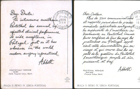
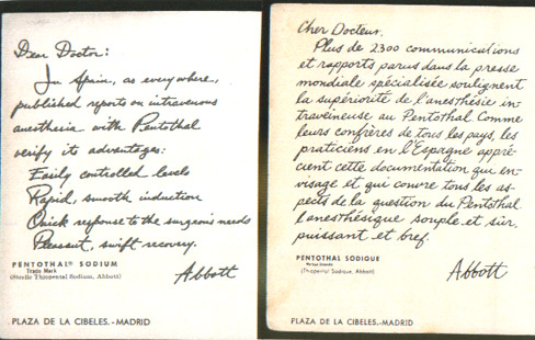
Figure 5. English-Text and French-Text Versions of Spain – Plaza de la Cibeles, Madrid (#149).
These two same-picture cards are in different script typefaces. In addition, the text messages are
completely different from one another. Note that the French-text version here is almost the same
as the French-text version of the Portugal – Praça D Pedro IV, Lisboa Card (#134) shown in Figure 4.
Two more exception cards of note are Portugal – Praça D Pedro IV, Lisboa (#134) (Figure 4) and Spain – Plaza de la Cibeles, Madrid (#149) (Figure 5). With each of these cards, not only are different script typefaces used for the English-text and French-text versions, but the English and French advertising messages themselves are different from one another! Curiously, the script typefaces used for the messages on the French-text versions of these two Portugal and Spain cards are virtually identical to one another (albeit the Portugal version text is in a smaller size). Furthermore, the advertising message on these French-text versions is identical as well (except on line 7, the Portugal card reads “…en Portugal…” while the Spain card reads “…en l’Espagne…”).
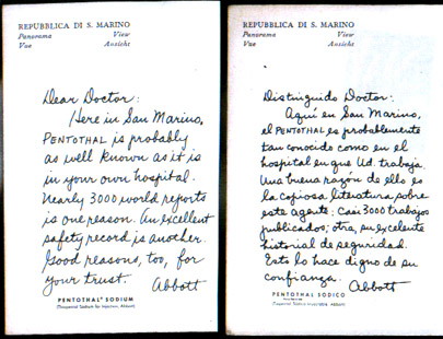
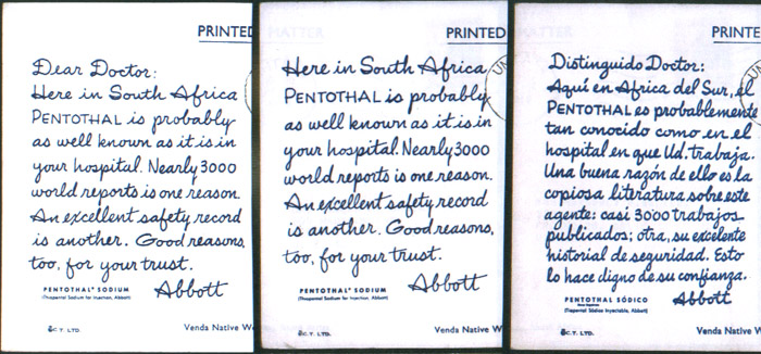
Figure 7. English-Text and Spanish-Text Versions of South Africa – Venda Native Women (#148).
The English-text “Dear Doctor” and Nurse Anesthetist (no salutation) versions of these same-picture
cards have the identical script typeface, but the script typeface is different on the Spanish-text version.
Two other exception cards listed in the Table are illustrated: San Marino – Panorama View and Castle (#142) (Figure 6), in which the script typeface of the Spanish-text version differs from the English-text version, and South Africa – Venda Native Women (#148) (Figure 7), in which the script typeface is identical for the "Dear Doctor” and Nurse-Anesthetist (no salutation) English-text versions but differs from the Spanish-text version.